If you’re working in the polar regions, you need reliable maps. From navigating sea ice to planning field camps, from studying penguin colonies to understanding ice sheet changes — geospatial data makes polar science possible.
British Antarctic Survey’s Mapping and Geographic Information Centre (MAGIC) provides the maps, satellite imagery, and location data that support UK polar research and operations.
Want to know how we map Antarctica?
Laura Gerrish from our MAGIC team explains the unique challenges of mapping the polar regions — from changing coastlines to working with satellite data in extreme conditions.
By ensuring expedition teams have access to up-to-date maps, MAGIC helps them plan their scientific research and stay safe in the remotest parts of the world.
What we offer
Maps and geospatial data
We create and maintain accurate maps of Antarctica and the Arctic. Our maps show coastlines, mountains, glaciers, research stations, and other features essential for polar work.
You can:
- Browse our map catalogue online
- Download digital maps for your research
- Request custom maps for specific areas
- Access historical mapping datasets
Satellite imagery and monitoring
Satellites give us a bird’s-eye view of the polar regions. We process satellite images to track changes in ice, monitor wildlife, and support navigation.
Recent examples:
- Counting emperor penguin colonies from space
- Tracking massive icebergs as they drift
- Monitoring vegetation growth on the Antarctic Peninsula
- Providing sea ice information for ship safety
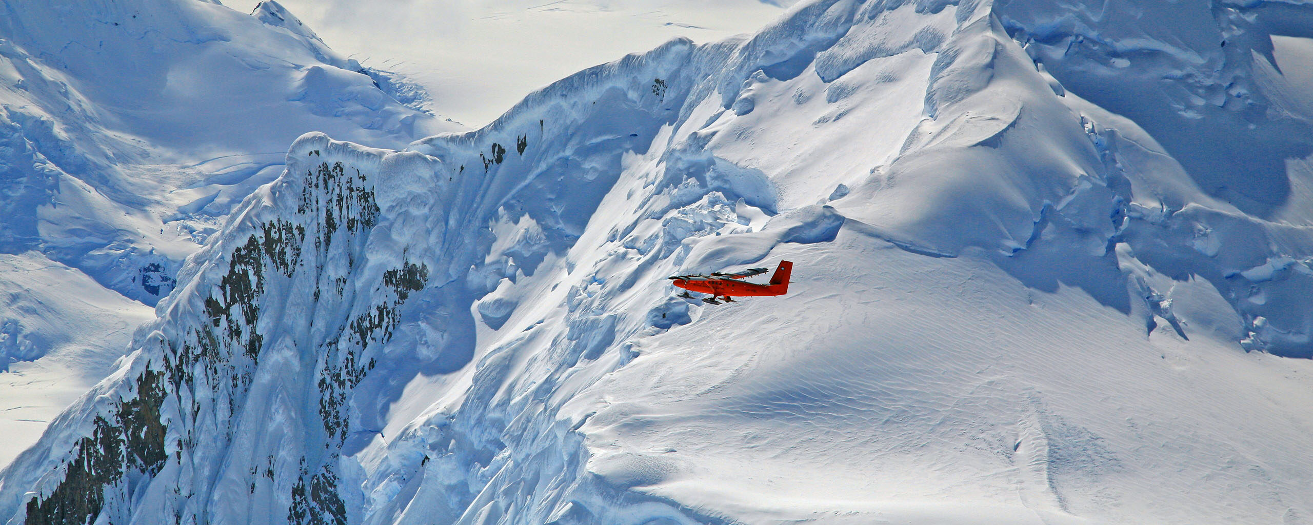
Geospatial support for field operations
Planning to work in Antarctica or the Arctic? We provide mapping and location data to help you work safely and effectively.
We support:
- Field camp planning and site selection
- GPS data collection and processing
- Aerial surveys using drones and aircraft
- 3D terrain modeling
Data and analysis tools
Our geospatial database stores detailed information about Antarctica and the Arctic. Scientists use this data to answer research questions and plan expeditions.
Available resources:
- Antarctic Digital Database (coastlines, place names, contours)
- Historical mapping datasets
- Satellite image archives
- Online mapping tools
Key services
For researchers
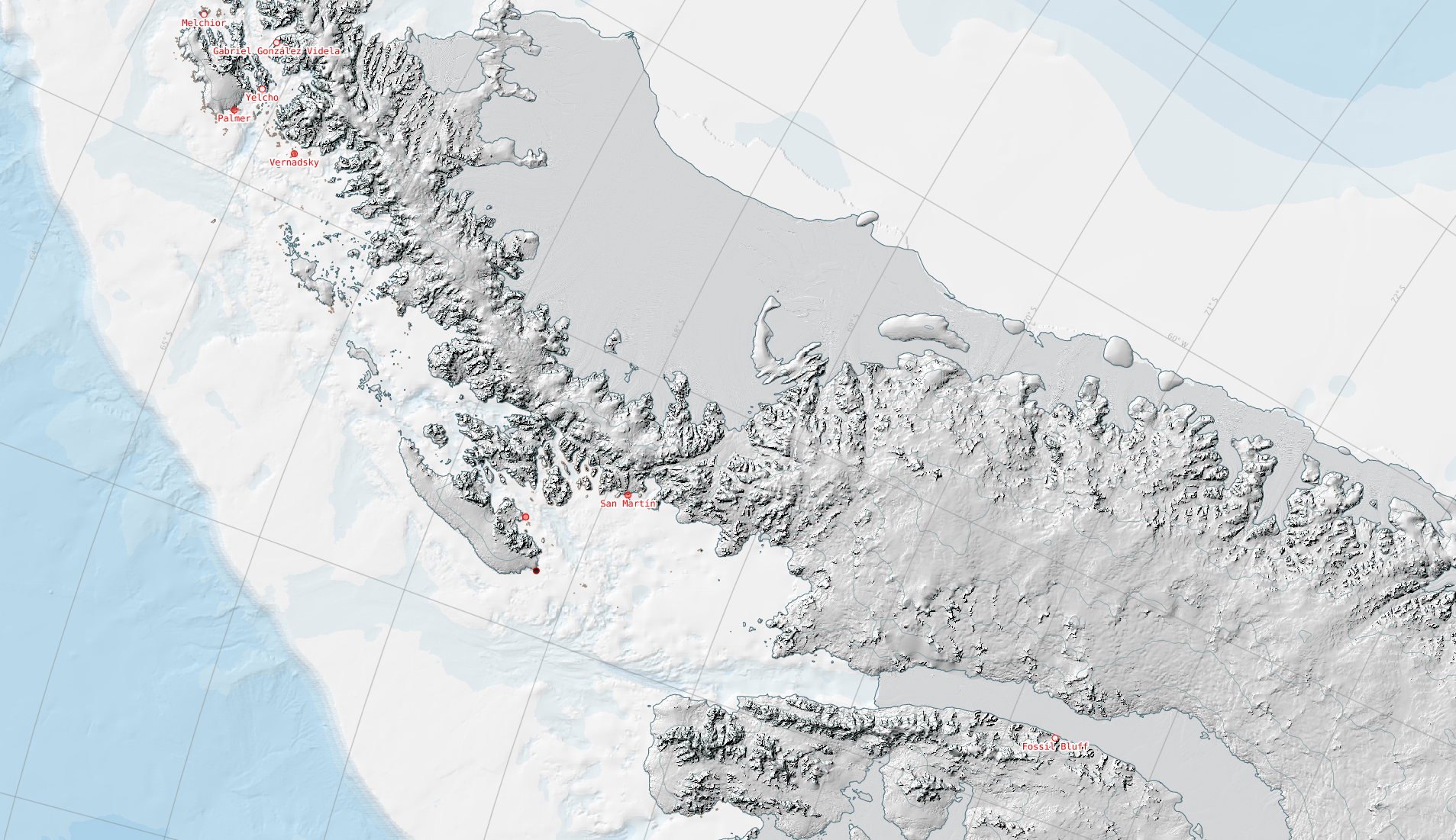
Antarctic Digital Database
The SCAR ADD is a seamless compilation of topographic data for Antarctica to 60°S. It is the place to go to get data such as Antarctic coastline or contours for working in desktop GIS.
Wildlife from Space
Many populations of wildlife are remote, inaccessible or difficult to monitor. The advent of sub-metre, Very-High-Resolution (VHR) satellite imagery has enabled us study these animals in a much more efficient way.
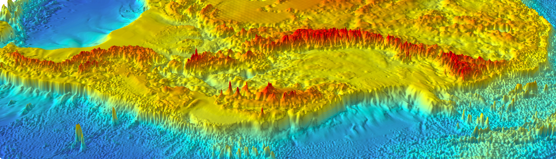
Bedmap
Bedmap is a collaborative community that has produced maps and datasets of Antarctic ice thickness and bed topography
For operations
Assets Tracking Service
The Assets Tracking Service shows where British Antarctic Survey ships, aircraft and vehicles are at any given time.

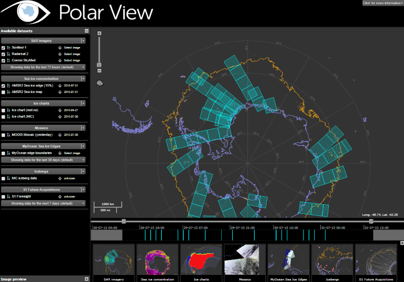
Polar View
Polar View delivers information about sea ice direct to ships operating in the Southern Ocean.
Technologies we use
We combine traditional surveying methods with cutting-edge technology:
Satellite imagery — Monitoring changes across vast polar regions
GPS and positioning — Accurate location data for maps and fieldwork
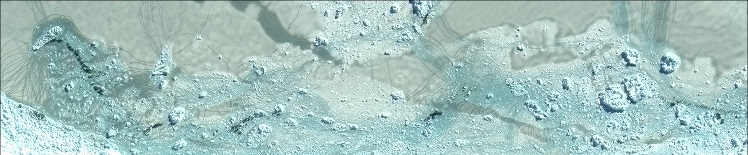
Laser scanning — Creating detailed 3D models of terrain
Drones and aircraft — Collecting high-resolution imagery and data
Geographic Information Systems (GIS) — Analyzing and visualizing spatial data
Our impact
The work of the Mapping and Geographic Information Centre supports:
- Science — Providing essential data for polar research projects
- Operations — Keeping people and equipment safe in extreme environments
- Conservation — Monitoring wildlife and environmental changes
- Policy — Informing decisions about Antarctic place names and territorial management
- Public understanding — Making polar regions accessible through maps and imagery
Frequently Asked Questions
Do you create maps for other organisations?
We primarily support BAS and UK polar activities, but collaborate with international partners on major mapping projects.
Can you map my specific research area?
Please contact us to discuss your needs. We may be able to provide custom mapping support for BAS-affiliated projects.
Where can I buy printed maps?
Several specialist retailers stock polar maps, please see our purchasing guide for more information.